
Process

Sketch

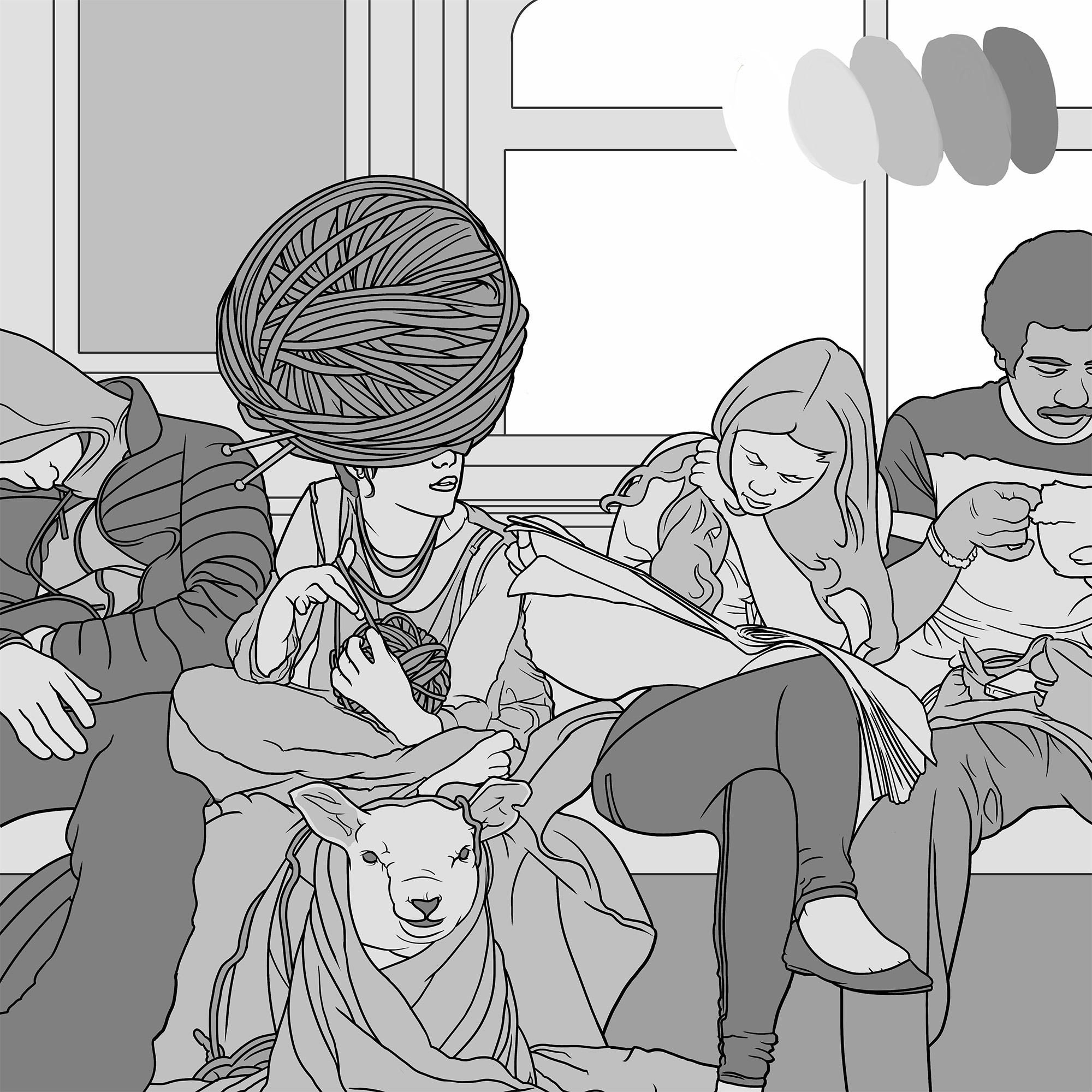
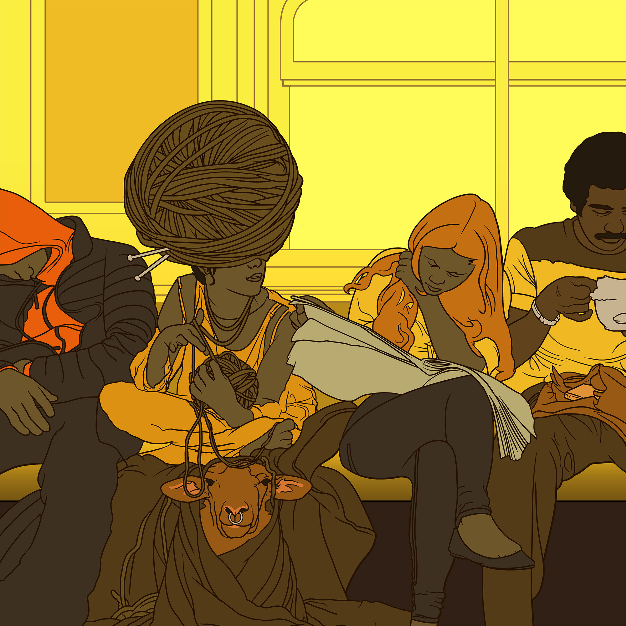
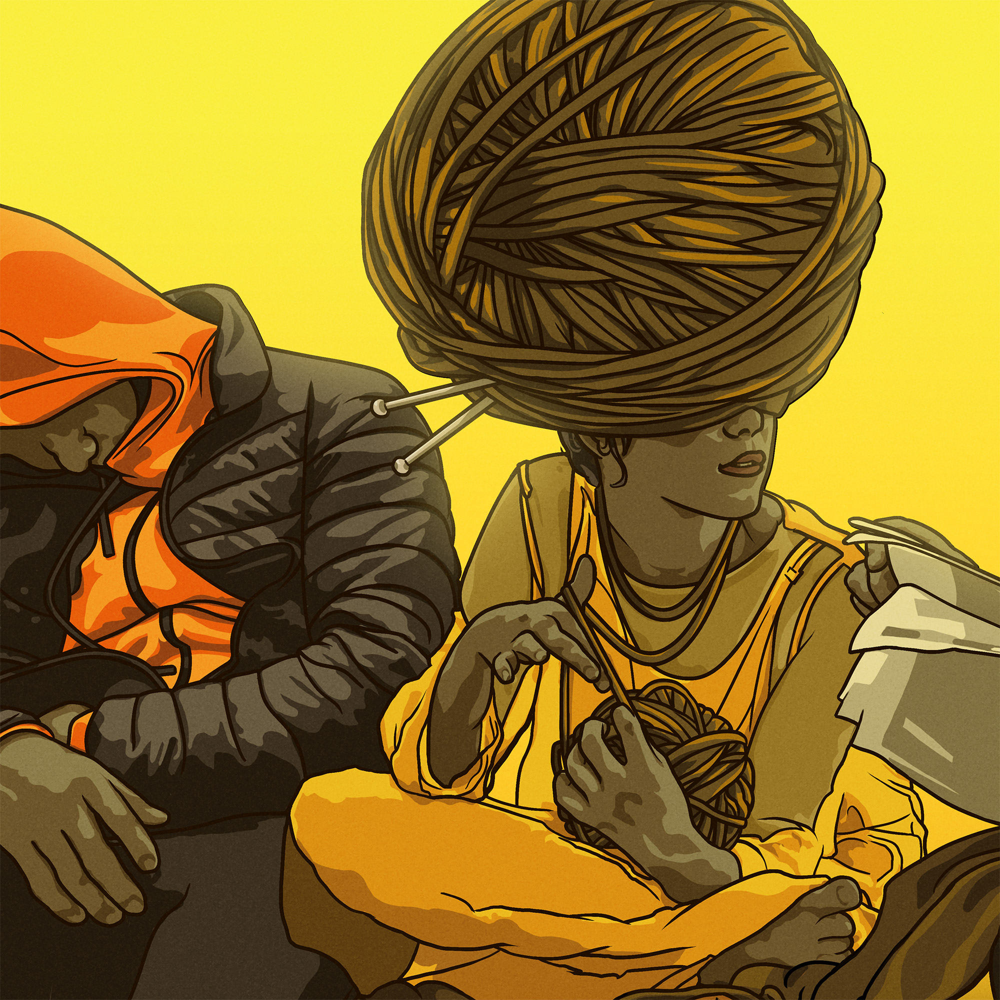
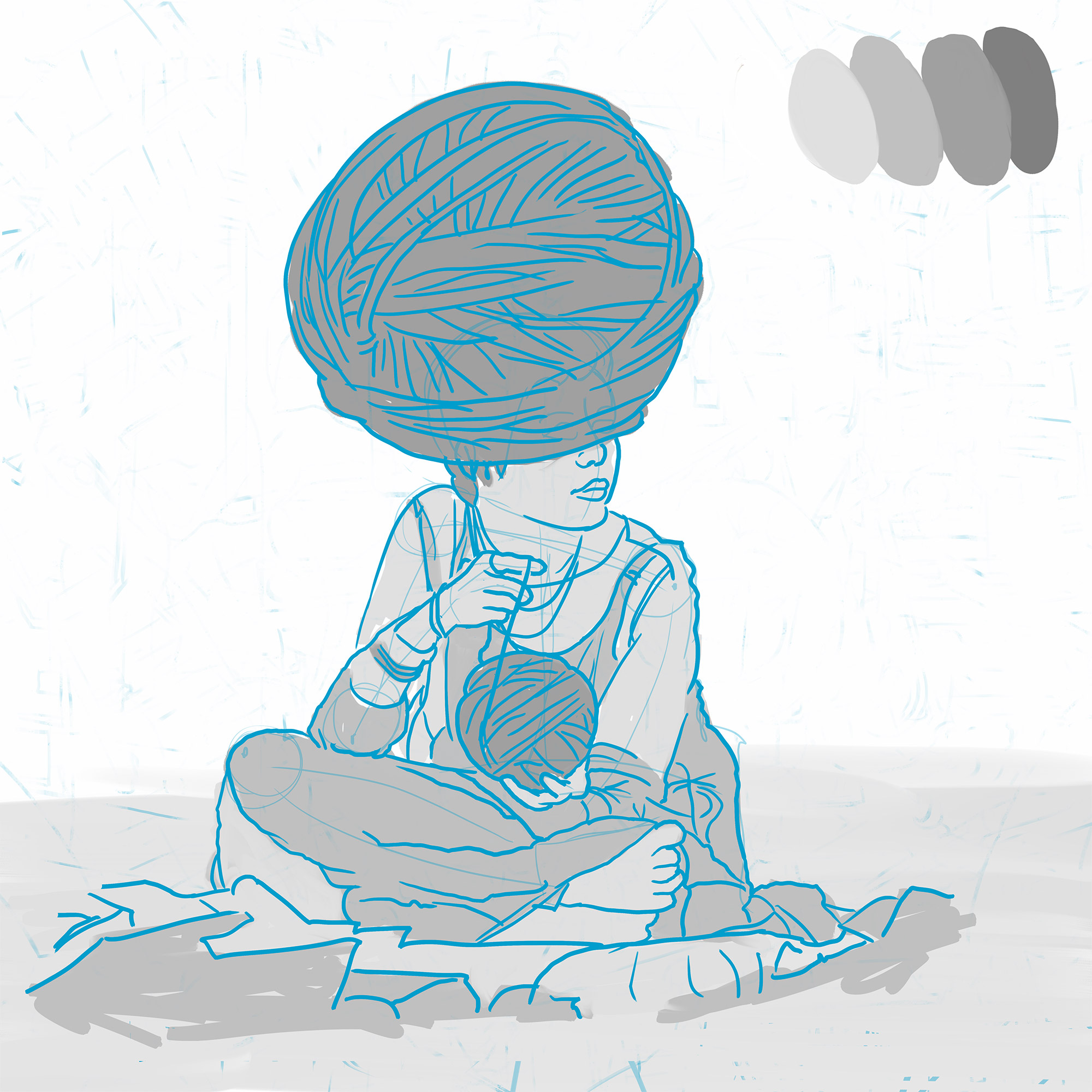
This piece started with a few sketches of a girl getting ready to knit with a few large balls of yarn in her lap. I’d originally planned to just tie her up in a giant spiderweb of strands, but as I redrew sections and moved the balls of yarn around, one accidentally moved over her head and become a hat, and the initial happy-accident concept was born.

Once a base idea is in place, I’ll add details until there’s enough interesting bits to carry a full piece, in this case deciding if she’ll be knitting or getting ready to knit, and fleshing out her location.

Reference

With the initial concept in mind, next I spend as much time as I can gathering reference. Too many artists skip this step to speed things along to the ‘fun’ drawing part, but I find this step can drastically improve the quality of your line work.

Subway layouts: how are they lit? What sorts of ads do they have on the walls? How are people usually sitting? What are they typically doing? How do people hold knitting needs? What are they looking at? What expressions do they make as they knit? Balls of yarn, the folds in a blanked tossed on a couch, animal expressions and proportions, materials, and so on.

Line Work

Once you’ve got your sketch in place, it’s time to set up your composition and starting drawing final lines. I work on a Wacom Intuos Pro in Photoshop, focusing primarily on shapes and perspective and making sure forms read well, and there’s enough figure/background contrast.

I’ll use thinner lines for interior detailing and thicker lines to separate objects. As I work I’ll separate each primary object into a distinct group, usually a per figure, middle-ground and background, so I can still move things around and fuss with the composition throughout the rest of the pipeline as needed.

Oddly, as I drew this piece somehow slowly became about people’s hands, so far be it from me to fight that, I made sure each passenger was doing something interesting and instantly readable with their hands.

Flats

Once I’m happy with the lines, I’ll rough out each individual color (shape) into separate layers in black and white, then start testing color schemes. Personally, I think this step is the most important. You’re setting up the visual hierarchy, the foreground/background contrast and legibility, color palette and lighting all at the same time.

Figure out how your scene is lit – there’s a big difference between indoor and outdoor lighting, tungsten or incandescent lights or diffuse sky-lighting. They’ll dictate how much contrast you’ll be working with in your scene, and can help focus areas of interest. Bright colors and pastels lend a light, upbeat mood, while darker colors can make a piece feel more ominous, mysterious or oppressive.

I aim to keep my color palettes ‘clean’ in the design sense, so I prefer to use a limited color palette, reuse colors where possible and avoid using multiple lines where one would do.

For this subway, I settled on a vibrant, vibrating sunset palette pushing all local color towards warm yellows and browns.

Shading

If everything has been set up well so far, the line work reads well and you’ve picked good colors in the previous steps, shading is usually pretty easy. Create a rough mental map of where the light sources are in your scene, then add in an additional brighter/more saturated highlight layer and a layer of darker, desaturated shadows.

Finally, time permitting, I’ll add in a few more minor lighting details as if it were a 3d rendering engine: tinted lights, bright specular highlights, reflection, refraction, bounce light, soft glows (Outer Glow in Photoshop) on bright direct light sources and a little bit of film grain to break up the perfectly even blocks of color.

©2025 Paper Raincoat